

Printing a photograph onto canvas turns a file into a physical object, and the qualities that make a great screen image are not quite the qualities that make a great canvas. Texture softens fine detail. Matte surfaces compress contrast. Wrapping around a frame eats several centimetres of the picture. None of this is a problem if you know about it in advance — and all of it is a problem if you find out when the finished piece arrives. This guide covers the material choices, the file requirements and the design decisions that determine whether a canvas print looks like art or like an enlarged snapshot.
Linen and cotton: a real difference, not marketing
Canvas for printing is woven from either cotton, linen (flax), or a poly-cotton blend, and the weave genuinely changes the result.
Cotton canvas has a relatively uniform, fine weave. It takes ink evenly, holds bright saturated colour well, and is the most common and most affordable option. Its texture is subtle — visible up close, largely invisible from two metres.
Linen canvas has a more irregular weave with visible slubs and a slightly warmer, more organic surface. Linen fibres are longer and stronger than cotton, so linen holds tension better over decades and is less prone to sagging in humidity changes. It is the traditional support for oil painting for exactly these reasons. Printed, it gives a distinctly more painterly result — the texture reads as part of the image rather than as a substrate.
Poly-cotton blends are the practical middle: dimensionally very stable, bright white base, excellent colour, and cheaper than pure linen. Most commercial canvas printing uses a blend.
The choice is genuinely aesthetic rather than one being better. Photographic work with fine detail — architecture, product shots, sharp portraits — usually looks best on a fine cotton or blend weave, where texture does not compete with detail. Painterly images, portraits intended to look like paintings, landscapes and anything with soft gradients gain from linen. Lithuanian producers offering Fotodrobės ant lino typically stock both, and asking for a physical sample of each before committing to a large piece is entirely normal and worth doing.
Coating and ink
Printable canvas is pre-coated so ink sits correctly on the fibres rather than wicking along them. Two coating types matter:
Matte coating is the standard for canvas. It suppresses reflections almost entirely, which is why canvas works in rooms with awkward lighting where a framed glossy print would be unviewable. The cost is a slightly reduced maximum contrast and black density.
Satin or semi-gloss coating raises saturation and black depth at the cost of some reflection. Useful for images that depend on deep shadow detail.
On ink: pigment inks rather than dye inks are what you want. Pigment particles are far more lightfast, giving decades of fade resistance in normal indoor light, whereas dye inks can visibly shift within a few years in a bright room. Any serious canvas printer uses pigment ink; it is still worth confirming.
Finally, a protective coat — a liquid laminate sprayed or rolled over the finished print — adds scratch resistance, moisture protection and further UV protection. It also lets a canvas be gently wiped clean, which an uncoated print cannot survive.
Stretching: gallery wrap, mirror wrap, and the border question
Once printed, canvas is stretched over a wooden frame (a stretcher bar). The depth of that bar and how the image handles the edges are the two decisions that most affect the finished look.
Bar depth is typically 2 cm (slim, modern, sits close to the wall) or 3.8-4.5 cm (a more substantial gallery look that reads as a serious piece from across a room). Larger canvases need the deeper bar for rigidity — above roughly 80 cm, a slim bar will bow over time unless cross-braced.
Gallery wrap continues the image around the sides of the frame. It looks clean and requires no frame, but it consumes image: with a 4 cm bar you lose roughly 4 cm from each edge of the picture, plus a further 1-2 cm folded behind. Compose for this, or crop deliberately.
Mirror wrap reflects the outer edge of the image around the sides, so nothing from the main picture is lost. This is the right choice when the composition is tight and cropping would cut something important. It is invisible from the front and looks natural from the side.
Colour wrap fills the sides with a solid colour sampled from the image — a clean, deliberate look that also preserves the full picture.
Bordered leaves a white or coloured margin around the image on the face, giving a print-in-a-frame feel without a frame.
For any image where the subject sits near the edge — a group photo, a portrait framed tightly, a landscape with a significant feature at the border — mirror wrap or colour wrap is almost always the better decision.
What the file needs
Canvas is more forgiving on resolution than paper because the weave breaks up fine detail, but there is still a floor.
- 150 dpi at final size is the practical minimum; 200-300 dpi is comfortable. A 60 × 40 cm canvas at 150 dpi needs roughly 3540 × 2360 pixels.
- Do not upscale aggressively. Modern upscaling is good, but it invents detail, and invented detail on a large canvas often reads as plasticky skin or smeared foliage. A genuinely small file printed slightly smaller looks better than a heavily upscaled one printed large.
- Add wrap allowance. Include enough image beyond the finished size to cover the bar depth plus 2 cm, or ask the printer to handle it and tell them which wrap you want.
- Colour space: send Adobe RGB or sRGB with the profile embedded, and let the printer convert. Canvas has a wide gamut and converting to a generic CMYK yourself usually loses more than it gains — this is the opposite of the advice for banner printing.
- Sharpening: apply slightly more than you would for screen. Canvas texture softens edges, and an image that looks correctly sharp on a monitor often looks slightly soft on canvas.
- File format: TIFF or high-quality JPEG at maximum quality. Avoid re-saving JPEGs repeatedly.
Which photographs work on canvas
Some images suit the medium and some fight it.
Works well: images with strong overall composition rather than fine detail; warm and mid-tone palettes; portraits with soft light; landscapes; anything with painterly qualities; black and white with good tonal separation.
Works poorly: images depending on extremely fine detail (dense text, intricate technical subjects); images with large areas of very deep shadow, since matte canvas cannot reach the black density of glossy paper; heavily grainy high-ISO images, where grain and canvas texture combine unpleasantly; and screenshots or graphics with hard geometric edges, which show the weave as a ragged line.
A useful test before committing to a large piece: view the image on screen at 100% and step back to roughly the distance you would view the finished canvas. If it holds up, it will print. Anyone ordering Nuotraukos ant drobės for the first time should also ask whether a small test print is available — on a large or important piece, a 20 × 30 cm proof costs very little and settles every question about colour and sharpness at once.
Sizing for a wall
A common mistake is ordering too small. A useful guideline: a canvas above a sofa or bed should span roughly two-thirds of the furniture’s width. Hang so the centre of the piece sits at about 145-150 cm from the floor — standing eye level — rather than centred on the wall, which usually places art too high.
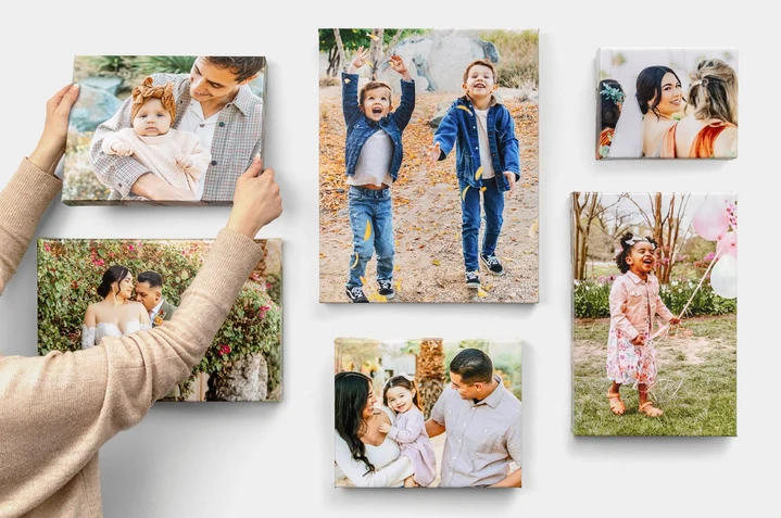
For a multi-piece arrangement, keep 5-8 cm between panels and treat the group as one rectangle when sizing it against the furniture below.
Care
Keep canvas out of direct sunlight, which fades any print eventually regardless of ink. Avoid bathrooms and any wall prone to condensation; canvas is fabric and will absorb moisture, which slackens the stretch. Dust with a dry soft brush or microfibre cloth. A coated canvas can be wiped with a barely damp cloth; an uncoated one cannot. If a canvas slackens in humid weather, it will usually re-tension itself as conditions dry — and if it does not, the stretcher bars have small wedges in the corners that can be tapped gently to take up the slack.
Summary
- Linen for painterly texture and long-term stability; cotton or blend for fine detail and value.
- Matte coating and pigment ink as the default; add a protective coat.
- Choose the wrap deliberately — mirror or colour wrap whenever the composition is tight.
- 150 dpi minimum at final size, 200-300 preferred; do not over-upscale; sharpen a little extra.
- Send RGB with an embedded profile and let the printer convert.
- Order a small proof before committing to a large or important piece.
